/* SP Valets — Home page sections. Responsive for mobile. */

const SECTION = { padding: "var(--section-y-md) 5%" };
const CONTAINER = { maxWidth: "var(--container-xxl)", margin: "0 auto" };
const INSTAGRAM_URL = "https://www.instagram.com/sp__valets/";
const PHONE_URL = "tel:+447565715968";

function Hero({ onBook, onNav }) {
  const { Button } = window.ReviveRefineDesignSystem_38ca5a;
  const isMobile = window.useIsMobile();
  return (
    <section className="scheme-1" style={{ position: "relative", minHeight: "100vh", display: "flex", alignItems: "center", justifyContent: "center", padding: "7rem 5% 4rem", overflow: "hidden" }}>
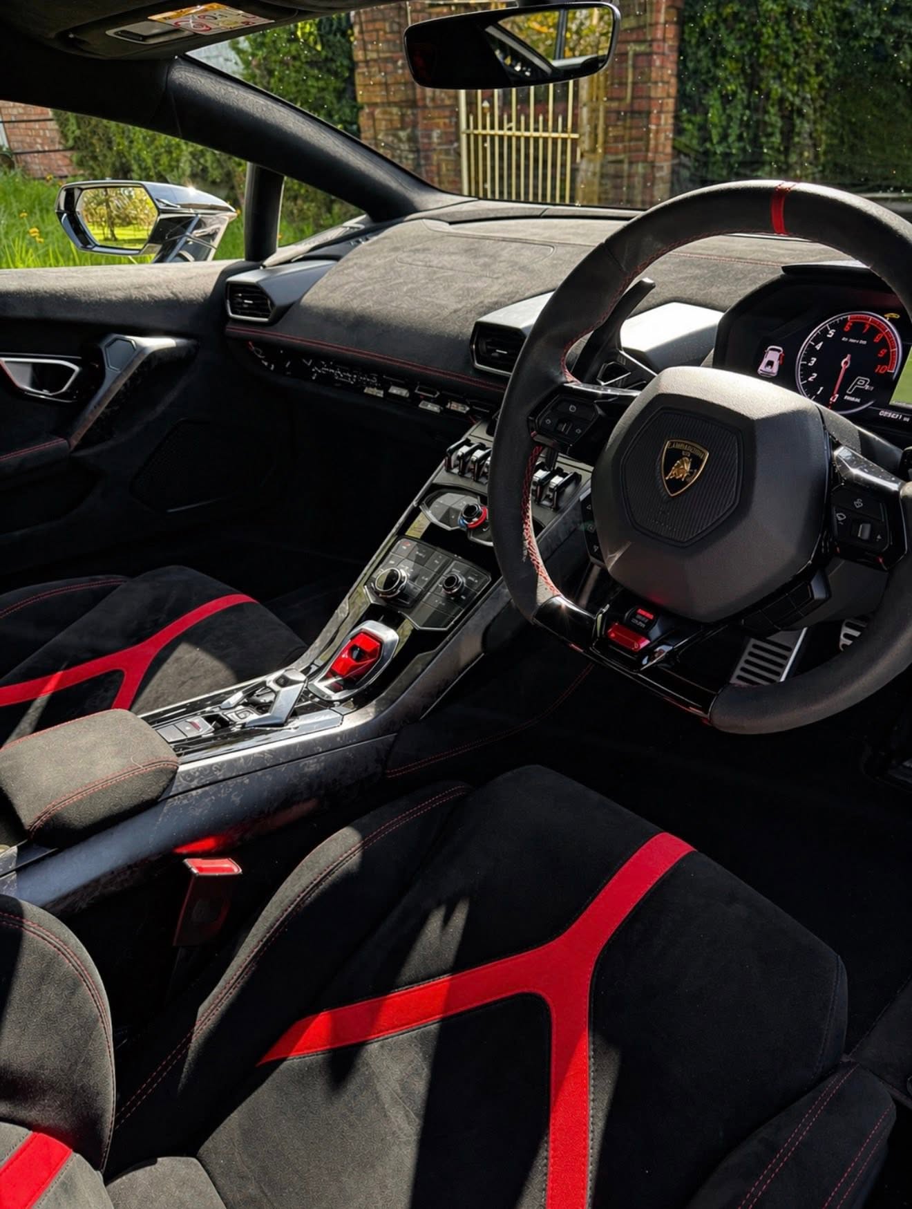
      <img src="./assets/images/hero.jpg" alt="SP Valets" style={{ position: "absolute", inset: 0, width: "100%", height: "100%", objectFit: "cover", objectPosition: "center center", zIndex: 0 }} />
      <div style={{ position: "absolute", inset: 0, zIndex: 1, background: "linear-gradient(180deg, rgba(10,10,12,0.84) 0%, rgba(10,10,12,0.66) 45%, rgba(10,10,12,0.95) 100%)" }} />
      <div style={{ position: "relative", zIndex: 2, textAlign: "center", maxWidth: "52rem" }}>
        <p style={{ fontSize: "var(--text-small)", fontWeight: 700, letterSpacing: "0.18em", textTransform: "uppercase", color: "var(--accent)", marginBottom: "var(--space-5)" }}>
          Professional valeting · Leeds
        </p>
        <h1 style={{ fontSize: isMobile ? "clamp(2.6rem, 9vw, 3.4rem)" : "clamp(3rem, 5vw, 4.5rem)", lineHeight: 1.05, marginBottom: "var(--space-5)", fontWeight: 800, color: "#FFFFFF" }}>
          <span style={{ display: "block" }}>Give your car the</span>
          <span style={{ display: "block" }}>care it deserves.</span>
        </h1>
        <p style={{ fontSize: "var(--text-medium)", color: "rgba(255,255,255,0.82)", marginBottom: "var(--space-8)", maxWidth: "34rem", marginLeft: "auto", marginRight: "auto" }}>
          Professional valeting, premium results, honest prices. Interior and exterior, done properly.
        </p>
        <div style={{ display: "flex", flexDirection: "row", justifyContent: "center", flexWrap: "wrap", gap: "var(--space-3)" }}>
          <Button variant="primary" onClick={() => window.open(INSTAGRAM_URL, "_blank")}>DM to book</Button>
          <Button variant="secondary" onClick={() => onNav && onNav("Services")}>See prices</Button>
        </div>
      </div>
    </section>
  );
}

function FeatureIntro() {
  const Icon = window.RRIcon;
  const isMobile = window.useIsMobile();
  const steps = [
    { icon: "chat", num: "01", title: "Drop us a message", body: "Tell us the car and what it needs. Or give us a ring." },
    { icon: "event_available", num: "02", title: "Book your slot", body: "We'll sort a time that works around you." },
    { icon: "auto_awesome", num: "03", title: "We get to work", body: "Snow foam, hand wash, interior — nothing skipped." },
    { icon: "star", num: "04", title: "Gleaming", body: "You get back a car you're happy to be seen in." },
  ];
  return (
    <section className="scheme-3" style={{ ...SECTION, borderTop: "1px solid var(--scheme-border)", borderBottom: "1px solid var(--scheme-border)" }}>
      <div style={CONTAINER}>
        <div style={{ textAlign: "center", marginBottom: "var(--space-12)" }}>
          <p style={{ fontWeight: 600, color: "var(--accent)", marginBottom: "var(--space-3)" }}>How it works</p>
          <h2>Simple from start to finish</h2>
        </div>
        <div style={{ display: "grid", gridTemplateColumns: isMobile ? "1fr 1fr" : "repeat(4, 1fr)", gap: isMobile ? "var(--space-6)" : "var(--space-8)", position: "relative" }}>
          {steps.map((s, i) => (
            <div key={s.num} style={{ display: "flex", flexDirection: "column", gap: "var(--space-4)" }}>
              <div style={{ display: "flex", alignItems: "center", gap: "var(--space-3)" }}>
                <span style={{ fontFamily: "var(--font-display)", fontSize: "var(--text-tiny)", fontWeight: 700, color: "var(--accent)", letterSpacing: "0.08em" }}>{s.num}</span>
                {!isMobile && i < steps.length - 1 && <div style={{ flex: 1, height: 1, background: "var(--scheme-border)" }} />}
              </div>
              <div style={{ display: "inline-flex", width: 44, height: 44, alignItems: "center", justifyContent: "center", borderRadius: "var(--radius-checkbox)", background: "var(--color-mongoose-lighter)", color: "var(--accent)" }}>
                <Icon name={s.icon} size={22} />
              </div>
              <div>
                <h5 style={{ marginBottom: "var(--space-2)" }}>{s.title}</h5>
                <p style={{ color: "var(--scheme-muted)", fontSize: "var(--text-small)" }}>{s.body}</p>
              </div>
            </div>
          ))}
        </div>
      </div>
    </section>
  );
}

const SERVICES = [
  { icon: "auto_fix", title: "Mini Valet", body: "Interior and exterior together — the everyday favourite.", price: "£20" },
  { icon: "cleaning_services", title: "Interior", body: "Hoovered throughout, surfaces cleaned and refreshed.", price: "£10" },
  { icon: "local_car_wash", title: "Exterior", body: "Snow foam pre-wash, hand wash and a proper dry.", price: "£10" },
  { icon: "directions_car", title: "4x4s & Larger Vehicles", body: "SUVs, pick-ups and vans priced by size.", price: "from £12" },
  { icon: "shield", title: "Exterior Protection", body: "Added protection to keep the finish looking sharp.", price: "from £5" },
];

function ServicesList() {
  const { Card, CardBody } = window.ReviveRefineDesignSystem_38ca5a;
  const Icon = window.RRIcon;
  const isMobile = window.useIsMobile();
  const [hovered, setHovered] = React.useState(null);
  return (
    <section className="scheme-3" style={SECTION}>
      <div style={CONTAINER}>
        <div style={{ maxWidth: "var(--container-md)", margin: "0 auto", textAlign: "center", marginBottom: "var(--space-12)" }}>
          <p style={{ marginBottom: "var(--space-3)", fontWeight: 600, color: "var(--accent)" }}>Services</p>
          <h2>Valet packages</h2>
          <p style={{ color: "var(--scheme-muted)", marginTop: "var(--space-3)" }}>Larger vehicles are priced by size. Message us with your car and we'll give you a straight price.</p>
        </div>
        <div style={{ display: "grid", gridTemplateColumns: isMobile ? "1fr" : "1fr 1fr", gap: "var(--space-8)", alignItems: "stretch" }}>
          {!isMobile && (
            <img src="./assets/images/services-feature.jpg" alt="What we offer" style={{ width: "100%", height: "100%", borderRadius: "var(--radius-image)", objectFit: "cover", aspectRatio: "4 / 5" }} />
          )}
          <div style={{ display: "flex", flexDirection: "column", justifyContent: "space-between", gap: "var(--space-4)" }}>
            {isMobile && (
              <img src="./assets/images/services-feature.jpg" alt="What we offer" style={{ width: "100%", borderRadius: "var(--radius-image)", objectFit: "contain", marginBottom: "var(--space-4)" }} />
            )}
            {SERVICES.map((s, i) => (
              <Card key={s.title} onMouseEnter={() => setHovered(i)} onMouseLeave={() => setHovered(null)} onClick={() => window.open(INSTAGRAM_URL, "_blank")} style={{ borderColor: "var(--color-neutral-lightest)", boxShadow: hovered === i ? "var(--shadow-md)" : "var(--shadow-sm)", transform: hovered === i ? "translateY(-4px)" : "translateY(0)", transition: "transform 0.18s ease, box-shadow 0.18s ease", cursor: "pointer" }}>
                <CardBody style={{ padding: "var(--space-5) var(--space-6)" }}>
                  <div style={{ display: "flex", alignItems: "center", justifyContent: "space-between", gap: "var(--space-3)" }}>
                    <div style={{ display: "flex", alignItems: "center", gap: "var(--space-3)" }}>
                      <span style={{ display: "inline-flex", width: 40, height: 40, alignItems: "center", justifyContent: "center", borderRadius: "var(--radius-checkbox)", background: "var(--color-mongoose-lighter)", color: "var(--accent)", flex: "none" }}>
                        <Icon name={s.icon} size={22} />
                      </span>
                      <h5 style={{ fontSize: "var(--text-h6)" }}>{s.title}</h5>
                    </div>
                    <Icon name="chevron_right" size={20} style={{ color: "var(--scheme-muted)", flex: "none" }} />
                  </div>
                  <p style={{ color: "var(--scheme-muted)", fontSize: "var(--text-small)", marginTop: "var(--space-3)" }}>{s.body}</p>
                  <p style={{ color: "var(--accent)", fontSize: "var(--text-small)", fontWeight: 600, marginTop: "var(--space-2)" }}>{s.price}</p>
                </CardBody>
              </Card>
            ))}
          </div>
        </div>
      </div>
    </section>
  );
}

const BENEFITS = [
  { icon: "verified", title: "Professional service", body: "Done properly, every time — no shortcuts and no rushed jobs." },
  { icon: "bolt", title: "Fast & reliable", body: "We turn up when we say we will and get it done." },
  { icon: "sentiment_satisfied", title: "Customer satisfaction", body: "You're not paying until you're happy with how it looks." },
];

function Benefits({ onNav }) {
  const { Button } = window.ReviveRefineDesignSystem_38ca5a;
  const Icon = window.RRIcon;
  const isMobile = window.useIsMobile();
  return (
    <section className="scheme-3" style={{ ...SECTION, paddingTop: 0 }}>
      <div style={CONTAINER}>
        <div style={{ display: "grid", gridTemplateColumns: isMobile ? "1fr" : "1fr 1fr", gap: isMobile ? "var(--space-8)" : "var(--space-16)", alignItems: "center" }}>
          <div>
            <h2 style={{ marginBottom: isMobile ? "var(--space-6)" : "var(--space-12)" }}>Why choose us</h2>
            {isMobile && (
              <img src="./assets/images/benefits.jpg" alt="Valeting in progress" style={{ width: "100%", borderRadius: "var(--radius-image)", objectFit: "cover", aspectRatio: "16 / 7", marginBottom: "var(--space-8)" }} />
            )}
            <div style={{ display: "grid", gap: "var(--space-8)" }}>
              {BENEFITS.map((b) => (
                <div key={b.title} style={{ display: "flex", gap: "var(--space-6)" }}>
                  <Icon name={b.icon} size={44} style={{ flex: "none", color: "var(--accent)" }} />
                  <div>
                    <h5 style={{ marginBottom: "var(--space-2)" }}>{b.title}</h5>
                    <p style={{ color: "var(--scheme-muted)" }}>{b.body}</p>
                  </div>
                </div>
              ))}
            </div>
            <div style={{ marginTop: "var(--space-8)" }}>
              <Button variant="primary" onClick={() => window.open(INSTAGRAM_URL, "_blank")}>
                DM to book <Icon name="arrow_forward" size={18} />
              </Button>
            </div>
          </div>
          {!isMobile && (
            <img src="./assets/images/benefits.jpg" alt="Valeting in progress" style={{ width: "100%", borderRadius: "var(--radius-image)", objectFit: "cover", aspectRatio: "4 / 5" }} />
          )}
        </div>
      </div>
    </section>
  );
}

function Gallery({ onNav }) {
  const isMobile = window.useIsMobile();
  const [hovered, setHovered] = React.useState(null);
  const [btnHovered, setBtnHovered] = React.useState(false);
  const images = [
    { src: "gallery-full-valet.jpg", label: "Mini Valet", sub: "Inside and out in one visit", pos: "center center" },
    { src: "gallery-0.jpg", label: "Exterior Wash", sub: "Snow foam and hand wash", pos: "center center" },
    { src: "gallery-ceramic.jpg", label: "Interior Clean", sub: "Hoovered, wiped and refreshed", pos: "center center" },
    { src: "gallery-interior.jpg", label: "4x4s & Larger Vehicles", sub: "SUVs and larger cars, priced by size", pos: "center center" },
  ];
  const visibleImages = isMobile ? images.slice(0, 2) : images;
  return (
    <section className="scheme-1" style={SECTION}>
      <div style={CONTAINER}>
        <div style={{ textAlign: "center", margin: "0 auto var(--space-12)", maxWidth: "var(--container-lg)" }}>
          <p style={{ marginBottom: "var(--space-4)", fontWeight: 600, color: "var(--accent)" }}>Our work</p>
          <h2>Results that speak for themselves</h2>
        </div>
        <div style={{ display: "grid", gridTemplateColumns: isMobile ? "1fr" : "1fr 1fr", gap: "var(--space-6)" }}>
          {visibleImages.map((img, i) => (
            <div key={i} onMouseEnter={() => setHovered(i)} onMouseLeave={() => setHovered(null)} style={{ border: "1px solid var(--color-neutral-lightest)", borderRadius: "var(--radius-image)", boxShadow: hovered === i ? "var(--shadow-md)" : "var(--shadow-sm)", overflow: "hidden", background: "var(--scheme-bg)", transform: hovered === i ? "translateY(-4px)" : "translateY(0)", transition: "transform 0.18s ease, box-shadow 0.18s ease", cursor: "pointer" }}>
              <img src={`./assets/images/${img.src}`} alt={img.label} style={{ width: "100%", height: isMobile ? "14rem" : "22rem", objectFit: "cover", objectPosition: img.pos, display: "block" }} />
              <div style={{ padding: "var(--space-4) var(--space-5)" }}>
                <p style={{ fontWeight: 600, color: "var(--scheme-text)", margin: 0 }}>{img.label}</p>
                <p style={{ fontSize: "var(--text-small)", color: "var(--scheme-muted)", margin: "var(--space-1) 0 0", display: "flex", alignItems: "center", gap: "var(--space-2)" }}>
                  <span style={{ display: "inline-block", width: 6, height: 6, borderRadius: "50%", background: "var(--accent)", flexShrink: 0 }}></span>
                  {img.sub}
                </p>
              </div>
            </div>
          ))}
        </div>
        <div style={{ textAlign: "center", marginTop: "var(--space-10)" }}>
          <a href={INSTAGRAM_URL} target="_blank" rel="noopener noreferrer" onMouseEnter={() => setBtnHovered(true)} onMouseLeave={() => setBtnHovered(false)}
            style={{ background: "none", border: "none", cursor: "pointer", color: "var(--accent)", fontWeight: 600, fontSize: "var(--text-small)", display: "inline-flex", alignItems: "center", gap: "var(--space-2)", padding: 0, textDecoration: "none", opacity: btnHovered ? 0.7 : 1, transform: btnHovered ? "translateX(3px)" : "translateX(0)", transition: "opacity 0.15s ease, transform 0.15s ease" }}>
            See more on Instagram <span style={{ fontSize: "1em" }}>›</span>
          </a>
        </div>
      </div>
    </section>
  );
}

const QUOTES = [
  { stars: 5, quote: "Thank you so much — you did a great job.", name: "ayeshaa_b.x", meta: "Instagram · Leeds" },
  { stars: 5, quote: "Fantastic job. I shall try to keep it this clean!", name: "nadiaa232416", meta: "Instagram · Leeds" },
  { stars: 5, quote: "Looks great. Very well done.", name: "antiatrocity", meta: "Instagram · Leeds" },
];

function Testimonials({ onBook }) {
  const { Card, CardBody } = window.ReviveRefineDesignSystem_38ca5a;
  const Stars = window.RRStars;
  const isMobile = window.useIsMobile();
  const [linkHovered, setLinkHovered] = React.useState(false);
  const [start, setStart] = React.useState(0);
  const PER_PAGE = isMobile ? 1 : 3;
  const total = QUOTES.length;
  const visible = Array.from({ length: PER_PAGE }, (_, i) => QUOTES[(start + i) % total]);
  const ArrowBtn = ({ onClick, icon }) => {
    const [hovered, setHovered] = React.useState(false);
    return (
      <button onClick={onClick}
        onMouseEnter={() => setHovered(true)}
        onMouseLeave={() => setHovered(false)}
        style={{ display: "flex", alignItems: "center", justifyContent: "center", width: 40, height: 40, borderRadius: "50%", border: "1px solid var(--scheme-border)", background: hovered ? "rgba(255,255,255,0.10)" : "transparent", cursor: "pointer", color: "var(--scheme-text)", transition: "background 0.15s" }}>
        <span className="material-symbols-rounded" style={{ fontSize: 20 }}>{icon}</span>
      </button>
    );
  };
  return (
    <section className="scheme-3" style={SECTION}>
      <div style={CONTAINER}>
        <div style={{ textAlign: "center", marginBottom: "var(--space-10)" }}>
          <p style={{ marginBottom: "var(--space-2)", fontWeight: 600, color: "var(--accent)" }}>Reviews</p>
          <h2 style={{ margin: 0 }}>What customers say</h2>
        </div>
        <div style={{ display: "grid", gridTemplateColumns: isMobile ? "1fr" : "1fr 1fr 1fr", gap: "var(--space-6)" }}>
          {visible.map((q, i) => (
            <Card key={i}>
              <CardBody style={{ padding: "var(--space-6)" }}>
                <Stars count={q.stars} />
                <p style={{ margin: "var(--space-3) 0 var(--space-4)", fontSize: "var(--text-medium)", color: "var(--scheme-text)" }}>"{q.quote}"</p>
                <div style={{ fontSize: "var(--text-small)", color: "var(--scheme-muted)" }}>
                  <strong style={{ color: "var(--scheme-text)" }}>{q.name}</strong> · {q.meta}
                </div>
              </CardBody>
            </Card>
          ))}
        </div>
        <div style={{ display: "flex", justifyContent: "center", gap: "var(--space-4)", marginTop: "var(--space-8)", marginBottom: "var(--space-4)" }}>
          <ArrowBtn icon="arrow_back" onClick={() => setStart((s) => (s - PER_PAGE + total) % total)} />
          <ArrowBtn icon="arrow_forward" onClick={() => setStart((s) => (s + PER_PAGE) % total)} />
        </div>
        <div style={{ display: "flex", justifyContent: "center", marginTop: "var(--space-4)" }}>
          <a href={INSTAGRAM_URL} target="_blank" rel="noopener noreferrer"
            onMouseEnter={() => setLinkHovered(true)} onMouseLeave={() => setLinkHovered(false)}
            style={{ color: "var(--accent)", fontWeight: 600, fontSize: "var(--text-small)", textDecoration: "none", opacity: linkHovered ? 0.7 : 1, transition: "opacity 0.15s ease" }}>
            See more on Instagram ›
          </a>
        </div>
      </div>
    </section>
  );
}

/* ---- Booking preview ---------------------------------------- */

const BOOKING_SERVICES = [
  { name: "Mini Valet",            note: "Inside and out",            price: "£20" },
  { name: "Interior",              note: "Hoover and surfaces",       price: "£10" },
  { name: "Exterior",              note: "Snow foam and hand wash",   price: "£10" },
  { name: "4x4s & Larger",         note: "Priced by size",            price: "from £12" },
];

const BOOKING_DAYS = ["Mon", "Tue", "Wed", "Thu", "Fri", "Sat"];
const BOOKING_SLOTS = ["09:00", "11:00", "13:00", "15:00"];

function Newsletter() {
  const isMobile = window.useIsMobile();
  const [service, setService] = React.useState(0);
  const [day, setDay] = React.useState(1);
  const [slot, setSlot] = React.useState(0);

  const pill = (active) => ({
    padding: "10px 14px",
    borderRadius: "var(--radius-checkbox)",
    border: active ? "1px solid var(--accent)" : "1px solid var(--scheme-border)",
    background: active ? "var(--color-mongoose-lighter)" : "transparent",
    color: active ? "var(--accent)" : "var(--scheme-muted)",
    fontSize: "var(--text-small)",
    fontWeight: active ? 600 : 400,
    cursor: "pointer",
    transition: "all 0.15s ease",
    whiteSpace: "nowrap",
  });

  return (
    <section className="scheme-1" style={SECTION}>
      <div style={{ ...CONTAINER, maxWidth: "var(--container-lg)" }}>

        <div style={{ textAlign: "center", marginBottom: "var(--space-10)" }}>
          <p style={{ marginBottom: "var(--space-3)", fontWeight: 600, color: "var(--accent)" }}>Booking</p>
          <h2 style={{ marginBottom: "var(--space-3)" }}>Pick a service and a time</h2>
          <p style={{ fontSize: "var(--text-medium)", color: "var(--scheme-muted)" }}>
            No back and forth — customers choose a slot themselves and the job lands straight in your diary.
          </p>
        </div>

        <div style={{
          display: "grid",
          gridTemplateColumns: isMobile ? "1fr" : "1fr 1fr",
          gap: isMobile ? "var(--space-8)" : "var(--space-10)",
          border: "1px solid var(--scheme-border)",
          borderRadius: "var(--radius-card)",
          padding: isMobile ? "var(--space-6)" : "var(--space-8)",
          background: "var(--surface-card)",
        }}>

          <div>
            <p style={{ fontSize: "var(--text-tiny)", fontWeight: 700, letterSpacing: "0.1em", textTransform: "uppercase", color: "var(--scheme-muted)", margin: "0 0 var(--space-4)" }}>
              1 · Choose your service
            </p>
            <div style={{ display: "flex", flexDirection: "column", gap: "var(--space-2)" }}>
              {BOOKING_SERVICES.map((s, i) => (
                <div key={s.name} onClick={() => setService(i)} style={{
                  display: "flex",
                  alignItems: "center",
                  justifyContent: "space-between",
                  gap: "var(--space-3)",
                  padding: "var(--space-4)",
                  borderRadius: "var(--radius-checkbox)",
                  border: service === i ? "1px solid var(--accent)" : "1px solid var(--scheme-border)",
                  background: service === i ? "var(--color-mongoose-lighter)" : "transparent",
                  cursor: "pointer",
                  transition: "all 0.15s ease",
                }}>
                  <div>
                    <p style={{ margin: 0, fontWeight: 600, color: "var(--scheme-text)", fontSize: "var(--text-small)" }}>{s.name}</p>
                    <p style={{ margin: "2px 0 0", color: "var(--scheme-muted)", fontSize: "var(--text-tiny)" }}>{s.note}</p>
                  </div>
                  <span style={{ fontWeight: 700, color: service === i ? "var(--accent)" : "var(--scheme-muted)", fontSize: "var(--text-small)" }}>{s.price}</span>
                </div>
              ))}
            </div>
          </div>

          <div style={{ display: "flex", flexDirection: "column" }}>
            <p style={{ fontSize: "var(--text-tiny)", fontWeight: 700, letterSpacing: "0.1em", textTransform: "uppercase", color: "var(--scheme-muted)", margin: "0 0 var(--space-4)" }}>
              2 · Pick a day
            </p>
            <div style={{ display: "flex", gap: "var(--space-2)", flexWrap: "wrap", marginBottom: "var(--space-6)" }}>
              {BOOKING_DAYS.map((d, i) => (
                <div key={d} onClick={() => setDay(i)} style={pill(day === i)}>{d}</div>
              ))}
            </div>

            <p style={{ fontSize: "var(--text-tiny)", fontWeight: 700, letterSpacing: "0.1em", textTransform: "uppercase", color: "var(--scheme-muted)", margin: "0 0 var(--space-4)" }}>
              3 · Pick a time
            </p>
            <div style={{ display: "grid", gridTemplateColumns: "1fr 1fr", gap: "var(--space-2)", marginBottom: "var(--space-6)" }}>
              {BOOKING_SLOTS.map((t, i) => (
                <div key={t} onClick={() => setSlot(i)} style={{ ...pill(slot === i), textAlign: "center" }}>{t}</div>
              ))}
            </div>

            <div style={{ marginTop: "auto", paddingTop: "var(--space-4)", borderTop: "1px solid var(--scheme-border)" }}>
              <p style={{ fontSize: "var(--text-small)", color: "var(--scheme-muted)", margin: "0 0 var(--space-4)" }}>
                {BOOKING_SERVICES[service].name} · {BOOKING_DAYS[day]} at {BOOKING_SLOTS[slot]} · <span style={{ color: "var(--accent)", fontWeight: 700 }}>{BOOKING_SERVICES[service].price}</span>
              </p>
              <a href={INSTAGRAM_URL} target="_blank" rel="noopener noreferrer" style={{
                display: "block",
                textAlign: "center",
                background: "var(--accent)",
                color: "var(--accent-contrast)",
                fontWeight: 700,
                fontSize: "var(--text-small)",
                padding: "14px 18px",
                borderRadius: "var(--radius-button)",
                textDecoration: "none",
              }}>
                Confirm booking
              </a>
            </div>
          </div>
        </div>

        <p style={{ textAlign: "center", fontSize: "var(--text-tiny)", color: "var(--scheme-muted)", marginTop: "var(--space-6)" }}>
          Preview only — live booking gets set up with the finished site.
        </p>
      </div>
    </section>
  );
}

Object.assign(window, { RRHero: Hero, RRFeatureIntro: FeatureIntro, RRServicesList: ServicesList, RRBenefits: Benefits, RRGallery: Gallery, RRTestimonials: Testimonials, RRNewsletter: Newsletter });